Changing the UI
Twenty Forty Ecchi » Devlog
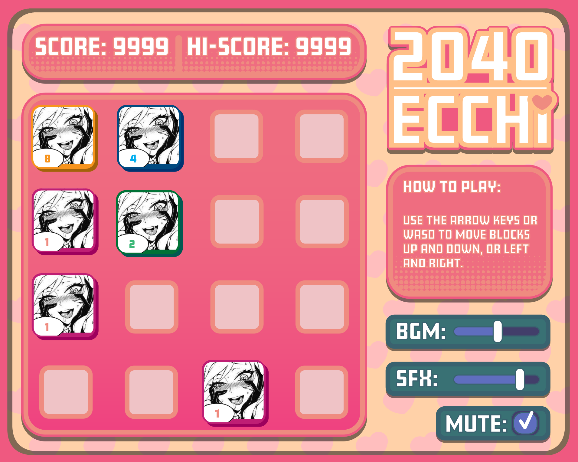
The UI updates are mostly done now. I wanted to shift the color scheme from purple to a brighter colour, like peach. I will use the purple motif for a later game. The number one priority was abandoning all of the Unity defaults. I still love the compact look though, just more uniform. I wonder if I should make a tablet version of this?

Twenty Forty Ecchi
A lewd take on 2048.
More posts
- New Look Complete!May 01, 2018
- Changing the ArtApr 08, 2018
- Update: March, 2018Mar 17, 2018
Leave a comment
Log in with itch.io to leave a comment.